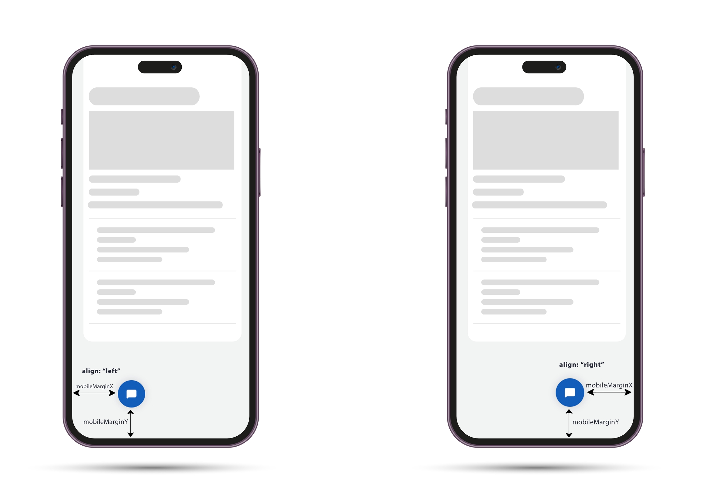
Mobile positioning

In this tutorial we will show to you how to better and simply position Tiledesk Widget on your website when in served on mobile browser Steps to make them is very easy:

  1. Copy and paste the basic widget script code

  2. Set mobileMarginX and mobileMarginY property inside window.tiledeskSettings

  3. Use the function window.Tiledesk(‘show’) to show the widget ONLY if some agent is available.

Here is the full code example

<html>
    <head>
        <script type="application/javascript">
            var PROJECT_ID = "<<TILEDESK_PROJECT_ID>>"
            window.tiledeskSettings=
            {
                projectid: PROJECT_ID,
                startHidden: true,
                mobileMarginX: "20px",
                mobileMarginY: "10px"
            };
            (function(d, s, id) {
                var w=window; var d=document; var i=function(){i.c(arguments);}; 
                i.q=[]; i.c=function(args){i.q.push(args);}; w.Tiledesk=i; 
                var js, fjs=d.getElementsByTagName(s)[0]; 
                if (d.getElementById(id)) return; 
                js=d.createElement(s); 
                js.id=id; js.async=true; js.src="https://widget.tiledesk.com/v6/launch.js";
                fjs.parentNode.insertBefore(js, fjs);
            }(document,'script','tiledesk-jssdk'));

        </script>
    </head>
    <body>
        This Tiledesk example will hide the widget if no agent is available
        <div>
            <b>Agents available:</b> <span id='available'>loading availability...</span>
        </div>
    </body>
</html>

Here is in detail what exactly mobileMarginX and mobileMarginY do

Last updated